Updates,
Better Emails Out of the Box
Saleor Team
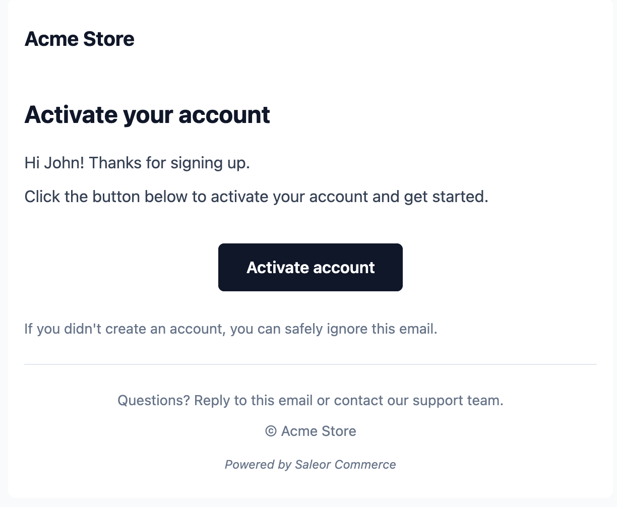
We redesigned every out-of-the-box customer email template. Most merchants will replace these with their own branded templates—that's expected. But defaults should show what's possible, not just what's minimally viable.
They're a proper reference implementation now, not placeholder scaffolding.
What's Different
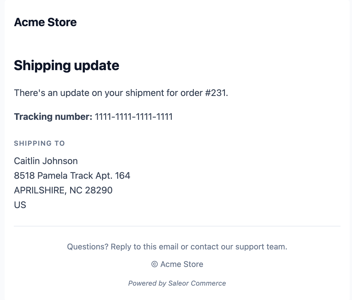
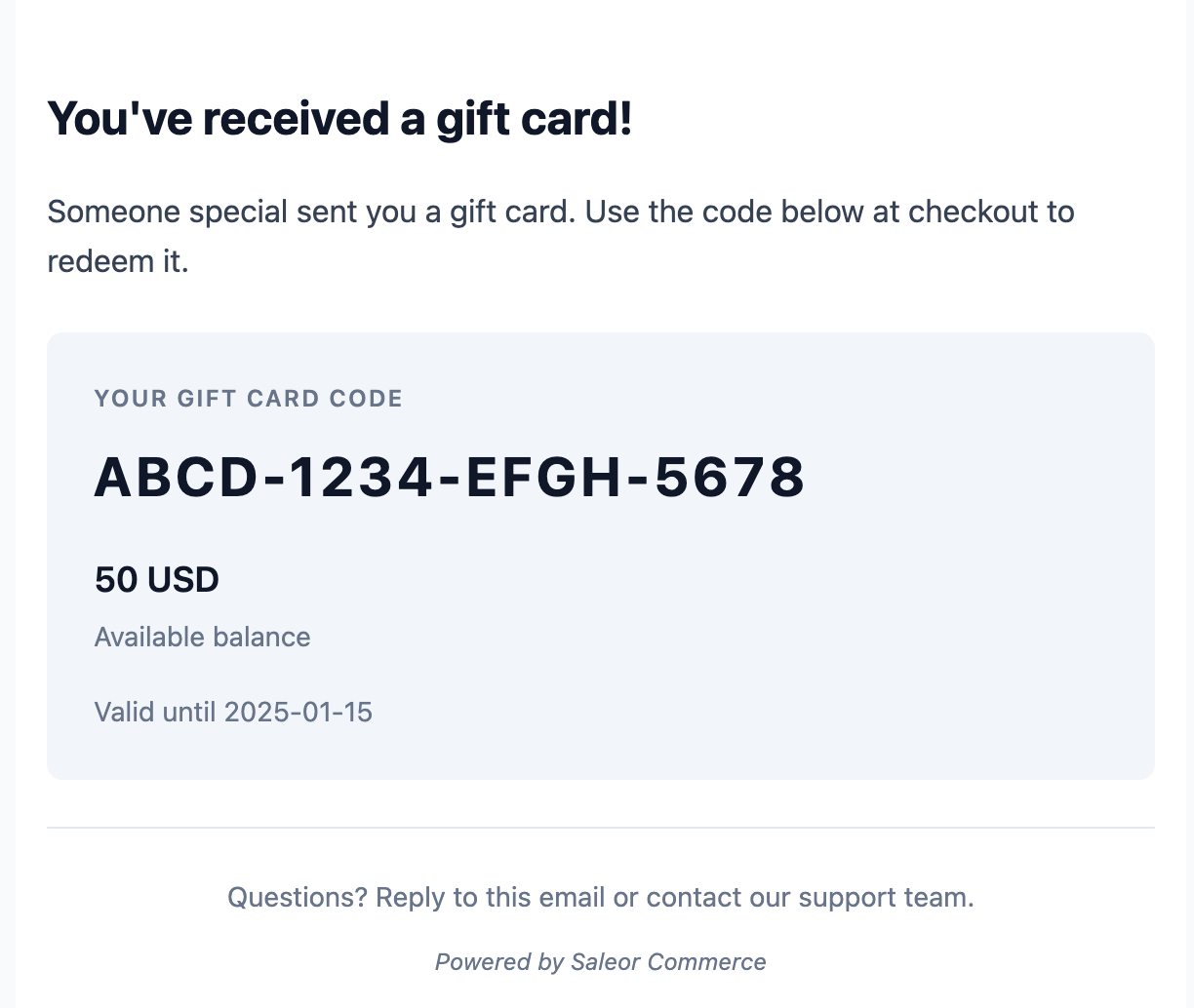
Every default template—order confirmations, fulfillment updates, account notifications—has been rebuilt:
- Product thumbnails in order emails. Customers actually see what they bought.
- Structured totals: subtotal, shipping, tax, then total. Not just a mystery number.
- Proper addresses formatted like addresses, not database dumps.
- Consistent design across all templates. Clean typography, subtle colors, rounded corners. Looks like it was made this decade.
- Header and footer branding with your store logo and name baked in.
The Editor Got a Serious Upgrade
If you do want to customize templates, the experience is now significantly less painful:
- Split-pane layout: MJML code on the left, live preview on the right.
- Tabbed editing: Switch between template and test payload without losing your place.
- Handlebars autocomplete: The editor knows your payload structure and suggests
{{variables}}as you type. No more guessing field names. - Inline template switcher: Jump between event types from a dropdown. Unsaved changes are protected.
- Better test data: Preview with realistic addresses, SKUs, thumbnails.
The short version: your emails will look better by default, you can brand them without writing a line of code, and creating your very own ones will no longer be an exercise in frustration.
Questions or feedback? Find us on Discord 👉 saleor.io/discord